A Rectangle is not enough! Building a Custom Header View in SwiftUI
How to use SwiftUI to give your app an custom header design
Recently, we have been responsible for building an iOS application from scratch.
After Apple's recent SwiftUI presentations, where they repeatedly emphasise the key advantages of declarative UI development, my colleagues and I have decided to not go with the traditional approach of designing user interfaces using UIKit, but instead to give SwiftUI a shot.
Learning SwiftUI
Besides the known Apple trend of overusing superlatives, the WWDC on-stage tutorials and explanations were quite in-depth, well presented and they featured lots of practical examples.
That being said, there is one thing that makes your life a lot harder: not fully adhering to Apple's design guidelines.Even subtle custom UI/UX modifications become rather difficult to implement, test and maintain.
Building a Custom Header View
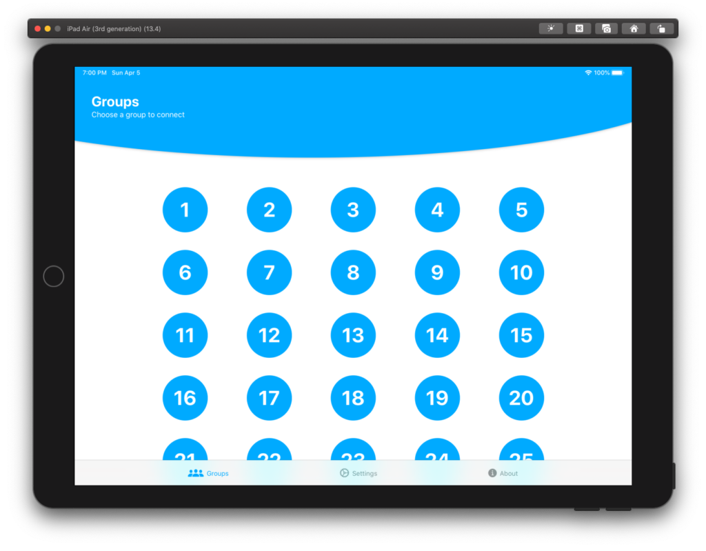
In our specific case, we wanted to implement a custom header for a grid view:
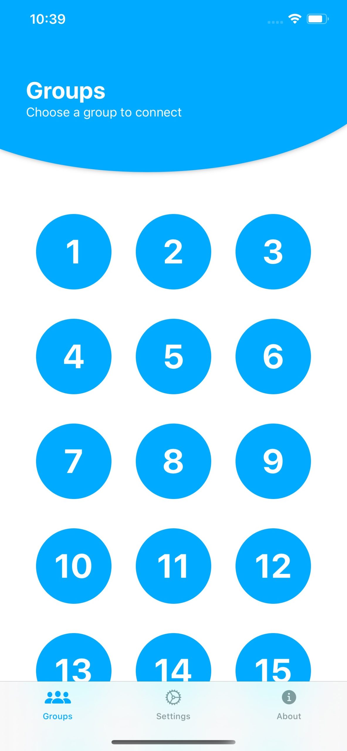
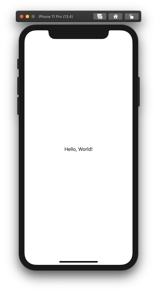
Firstly, let's create a SwiftUI View that takes a `title` and `subtitle` string and a `bgColor` background color as its input parameters. Since we're building a multi-language application, the two strings are going to be of type `LocalizedStringKey`. As our preview background color, we have created a color and called it "customBlue".
import SwiftUI

struct HeaderView: View {
    let title: LocalizedStringKey
    let subtitle: LocalizedStringKey
    var bgColor: Color

    var body: some View {
        Text("Hello, World!")
    }
}

struct HeaderView_Previews: PreviewProvider {
    static var previews: some View {
        HeaderView(title: "Title", subtitle: "Subtitle", bgColor: Color("customBlue"))
    }
}
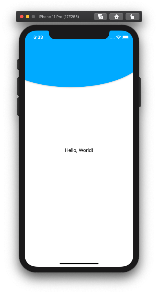
Next, we add a `ZStack` that is supposed to put some text on top of an ellipse. To define the size and position of the ellipse device-independently, we wrap everything with a `GeometryReader` that lets us read the width and height properties of the device in use.
Note that the `position` modifier positions the center of a View relative to the top left of the screen's safe area. To ignore the safe area, we use the `edgesIgnoringSafeArea` modifier.
import SwiftUI

struct HeaderView: View {
    let title: LocalizedStringKey
    let subtitle: LocalizedStringKey
    var bgColor: Color

    var body: some View {
        GeometryReader { geometry in
            ZStack {
                Ellipse()
                .fill(self.bgColor)
                .frame(width: geometry.size.width * 1.4, height: geometry.size.height * 0.33)
                .position(x: geometry.size.width / 2.35, y: geometry.size.height * 0.1)
                .shadow(radius: 3)
                .edgesIgnoringSafeArea(.all)

                Text("Hello, World!")
            }
        }
    }
}

struct HeaderView_Previews: PreviewProvider {
    static var previews: some View {
        HeaderView(title: "Groups", subtitle: "Choose a group to connect", bgColor: Color("customBlue"))
    }
}

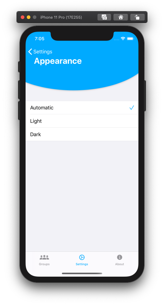
While the light color scheme is active, the status bar defaults to being dark. In order to change the status bar style, we implement our own `HostingController`, which inherits from `UIHostingController` and overrides the `preferredStatusBarStyle` variable.
import SwiftUI

class HostingController<Content> : UIHostingController<Content> where Content : View {
    @objc override dynamic open var preferredStatusBarStyle: UIStatusBarStyle {
        .lightContent
    }
}
Then, we proceed to replace `UIHostingController` with `HostingController` in `SceneDelegate.swift` to actually use our derived class.
window.rootViewController = HostingController(rootView: contentView)
The result looks as expected:
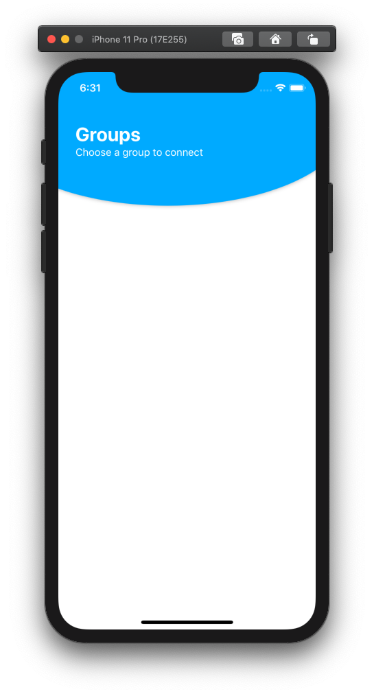
Next, we want to vertically position our `title` and `subtitle` strings. Instead of using the `position` modifier, we can utilize the `Spacer` View that, according to Apple's docs, "expands along the major axis of its containing stack layout":
import SwiftUI

struct HeaderView: View {
    let title: LocalizedStringKey
    let subtitle: LocalizedStringKey
    var bgColor: Color

    var body: some View {
        GeometryReader { geometry in
            ZStack {
                Ellipse()
                .fill(self.bgColor)
                .frame(width: geometry.size.width * 1.4, height: geometry.size.height * 0.33)
                .position(x: geometry.size.width / 2.35, y: geometry.size.height * 0.1)
                .shadow(radius: 3)
                .edgesIgnoringSafeArea(.all)

                HStack {
                    VStack(alignment: .leading) {
                        Text(self.title)
                            .font(.title)
                            .fontWeight(.bold)
                            .foregroundColor(Color.white)

                        Text(self.subtitle)
                            .font(.subheadline)
                            .fontWeight(.regular)
                            .foregroundColor(Color.white)

                        Spacer()
                    }
                    .padding(.leading, 25)
                    .padding(.top, 30)

                    Spacer()
                }
            }
        }
    }
}

struct HeaderView_Previews: PreviewProvider {
    static var previews: some View {
        HeaderView(title: "Groups", subtitle: "Choose a group to connect", bgColor: Color("customBlue"))
    }
}
Obviously, this is nowhere close to being ready to ship: We need to consider aspects like device-specific paddings and support for landscape orientation and back buttons. Catching a glimpse of the production code in the aforementioned application, we see that our `HeaderView` has been extended appropriately:
import SwiftUI

struct HeaderView: View {
    let title: LocalizedStringKey
    let subtitle: LocalizedStringKey
    var bgColor: Color
    @EnvironmentObject var orientationModel: OrientationModel

    var body: some View {
        GeometryReader { geometry in
            ZStack {
                if UIDevice.current.userInterfaceIdiom == .pad {
                    Ellipse()
                    .fill(self.bgColor)
                    .frame(width: geometry.size.width * 1.4,
                           height: self.orientationModel.landscape ? geometry.size.height * 0.5 : geometry.size.height * 0.4)
                    .position(x: geometry.size.width / 2.35,
                              y: geometry.size.height * 0.025)
                    .clipShape(Rectangle())
                    .shadow(radius: 3)
                } else if UIDevice.current.userInterfaceIdiom == .phone {
                    Ellipse()
                    .fill(self.bgColor)
                    .frame(width: geometry.size.width * 1.4,
                           height: geometry.size.height * 0.45)
                    .position(x: geometry.size.width / 2.35,
                              y: geometry.size.height * 0.105)
                    .clipShape(Rectangle())
                    .shadow(radius: 3)
                }

                HStack {
                    VStack(alignment: .leading) {
                        Text(self.title)
                            .font(.title)
                            .fontWeight(.bold)
                            .foregroundColor(Color.white)

                        Text(self.subtitle)
                            .font(.subheadline)
                            .fontWeight(.regular)
                            .foregroundColor(Color.white)

                        Spacer()
                    }
                    .padding(.leading,
                             self.orientationModel.landscape ?
                                geometry.size.width * 0.03 :
                                (UIDevice.current.userInterfaceIdiom == .phone ? geometry.size.width * 0.075 : geometry.size.width * 0.04))
                    .padding(.top, UIDevice.current.userInterfaceIdiom == .phone ?
                                geometry.size.height * 0.135 :
                                geometry.size.height * 0.08)

                    Spacer()
                }
            }.edgesIgnoringSafeArea(.all)
        }
    }
}

struct HeaderView_Previews: PreviewProvider {
    static var previews: some View {
        HeaderView(title: "groups", subtitle: "chooseGroupToConnect", bgColor: Color.primaryColor).environmentObject(OrientationModel(isLandscape: false))
    }
}
`OrientationModel` is a simple `ObservableObject` that keeps track of the device's orientation. As the developed application does not support landscape orientation on iPhones, this was not considered in this snippet of code.
This way, the custom header looks neat on all devices, including iPads:
To make it blend nicely with existing iOS title bar elements (such as the back button), I've decided to configure the styles of `UINavigationBar` such that the title text is invisible.This has the advantage of still showing the iOS back button accordingly:
Bugs, Bugs, Bugs
As much as I like the freedom of declarative UI design and the way SwiftUI lets you develop these, it sometimes still feels like a beta version and is far away from being polished and mature.
We've encountered numerous bugs ranging from being mildly annoying up to completely breaking our design. Many of them were introduced by iOS and XCode updates, while other issues were reported months ago and still remain unfixed as of April 2020.
SwiftUI is here to stay and we love the new way to create iOS apps. If you have a project where you need a project partner just drop us an email and we will do it for you!